
Enter a CSS pixel size and its reference font size to calculate the matching em value for your CSS rule.
Table of contents
How to use our Px to Em Converter
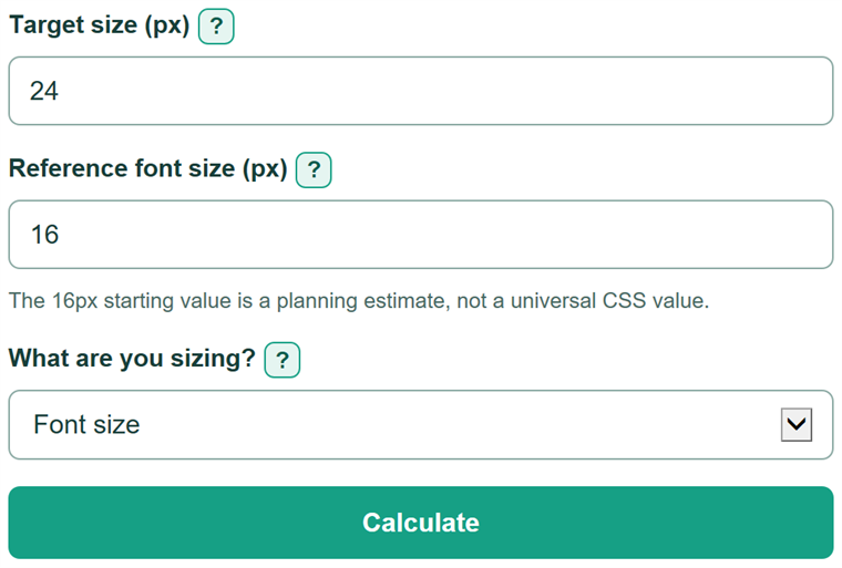
- Enter the target size in px from a design, CSS rule, or browser DevTools.
- Enter the computed reference font size in px. Keep 16px only if no relevant CSS rule changes that size.
- Choose "Font size" or "Padding, margin, width, height, or another property" so the calculator tells you which element to check.
- Click Calculate and copy the CSS value in em into your declaration.
- Sanity-check the answer: a target equal to the reference is 1em, so 24px divided by 16px is 1.5em.
Definitions
px (CSS pixel): A CSS length unit commonly used in designs and CSS rules.
em: A relative CSS length unit based on a font size. In a font-size declaration, it is based on the direct parent's computed font size. For many other properties, it is based on the current element's computed font size. [1][2]
Reference font size: The computed font size in px used to divide the target px size.
Computed font size: The final font size shown in browser DevTools after CSS rules and inheritance are applied.
Percent of reference: The target size compared with the reference font size. 100% means the two sizes are equal.
Common mistakes and quick fixes
Mistake: Leaving the reference font size at 16px after a parent or component changes it.
Fix: Check the applicable computed font size in browser DevTools and enter that px value.
Mistake: Using the root or body font size for a nested font-size rule.
Fix: For font-size, use the direct parent's computed font size.
Mistake: Using the parent font size for padding, margin, width, or height.
Fix: For these properties, use the current element's computed font size.
Mistake: Entering 0 or a negative reference font size.
Fix: Enter a positive px value. Dividing by zero is undefined.
Mistake: Treating em like rem in nested elements.
Fix: Inspect the computed size on the relevant element because nested em font sizes can compound.
Limitations & Key Assumptions / Boundary Conditions
- The result depends on the reference font size entered. 16px is a common starting value, not a universal CSS value.
- For font-size, use the direct parent's computed font size. For many other em-based properties, use the current element's computed font size.
- Nested em font sizes can compound, so a root or body font size may not match the relevant computed size.
- This calculator performs direct px-to-em arithmetic. It does not predict effects from layout rules, transforms, browser zoom, or responsive CSS.
- The reference font size must be greater than 0px. A target size of 0px is valid and converts to 0em.
Methodology
Calculation
The calculator divides the target CSS size by the applicable computed reference font size. The property choice helps you identify that reference and does not change the division.
em = target size (px) / reference font size (px)
percent of reference = 100 * target size (px) / reference font size (px)
Worked example
For a target of 24px and a reference of 16px, divide 24 by 16. The answer is 1.5em. The target is also 150% of the reference size.
Reference point
For a font-size declaration, em is relative to the direct parent's computed font size. For properties such as padding, margin, width, and height, it is relative to the current element's computed font size. [1][2]